Flat vs Skeuomorphic Design
March 28, 2018
Reading Time: 3 minutes
There’s so much to think about when it comes to web and graphic design – your business objectives, customers, and marketing channels are just some of the things we consider when designing for you.
This time we thought we’d let you in on an aspect of our design processes…
One of the ways we decide an approach is identifying whether you need flat design or skeuomorphic. Here’s a little bit of insight from the design team on what these mean and why they’re important.
First of all, what do these mean?
Flat design and skeuomorphic design are two different approaches; the whole point of skeuomorphism is relatable design and easy recognition, whereas flat design focuses on keeping it simple, with functionality over looks.
Skeuomorphism is where a design mimics its real-world counterpart, and was used heavily when people were initially making the transition to digital. It made software understandable and easier to use. For example, we understand the functions of a folder, camera or trash can on our desktop because we can easily relate them to how we use them in real life.
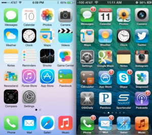
One of the biggest skeuomorphism champions was Apple – using the old-school phone icon, making icons look like real buttons, iBooks looking like a bookshelf and the contacts app looking like a diary are perfect examples of how Apple used this technique to make the switch to iPhone as seamless as possible.
This technique has been simplified since then, for example on the new versions of iOS, but it’s not likely to disappear. We’ll always look for the envelope icon to send an email, the floppy disk icon to save, the ‘plus’ sign to add something new, and so on.
But now, there’s a whole new generation who has never used a floppy disk or telephone and will not need the visual metaphor. This is where flat design has risen over recent years.
Flat design focuses more on visual clarity and content, removing the clutter of gradients and shadows, and replacing it with clean, crisp, two-dimensional design. Particularly in digital, if an aspect has no functional purpose, it’s unnecessary clutter, and could distract from user experience.
Where has this lead to?
A mix of both – skeuomorphism won’t die, and neither will flat take over. In 2014, Google launched material design, a bridge between flat and skeuomorphic, taking the best of both. Material design keeps everything simple, while still creating depth, with subtle shadows and animations so you can ‘see’ your click or action taken.
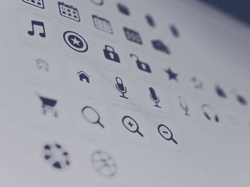
Here’s how we’ve used material design at ninetyblack:
While designs are flat in general, you can still see subtle drop-shadows, background images creating depth and elements of skeuomorphic like the locator icons and plus signs.