Lee Brothers Marketing Refresh
Elevating marketing collateral for a new era of growth
Lee Brothers Cabinets and Joinery, operating in Rotorua since 1926, are renowned for their top-class joinery. As they look toward their century mark, they were in need of some high quality marketing collateral to help take their business into a new era.
The challenge for ninetyblack was designing and creating marketing material that would reflect the skill and experience of their master craftspeople, the capability of their workshop, and the unmatched quality of their work. The first task was creating a set of brand guidelines that would set a cohesive tone for all future marketing materials.
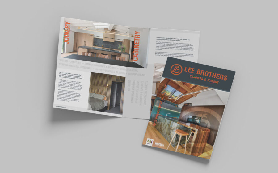
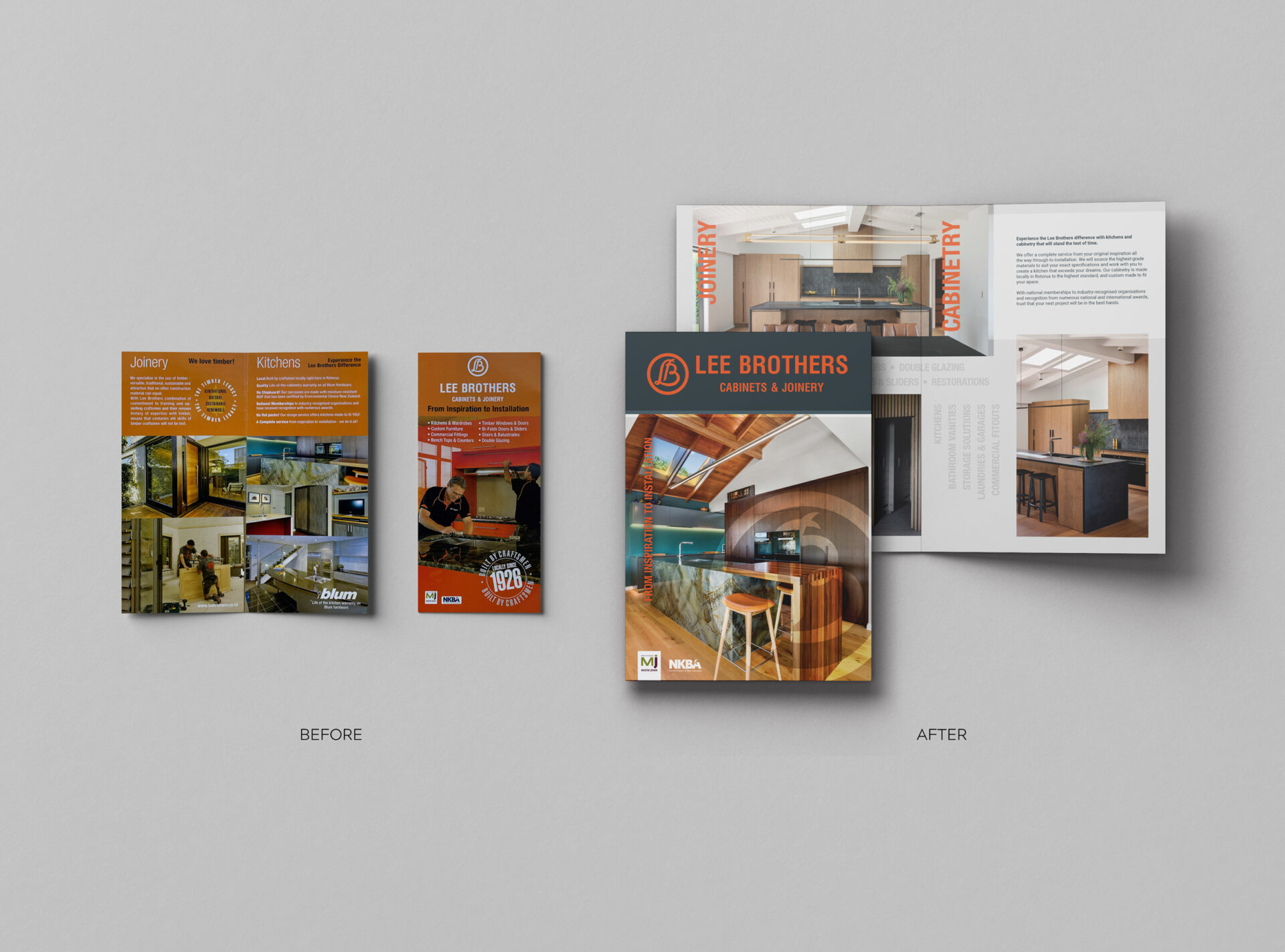
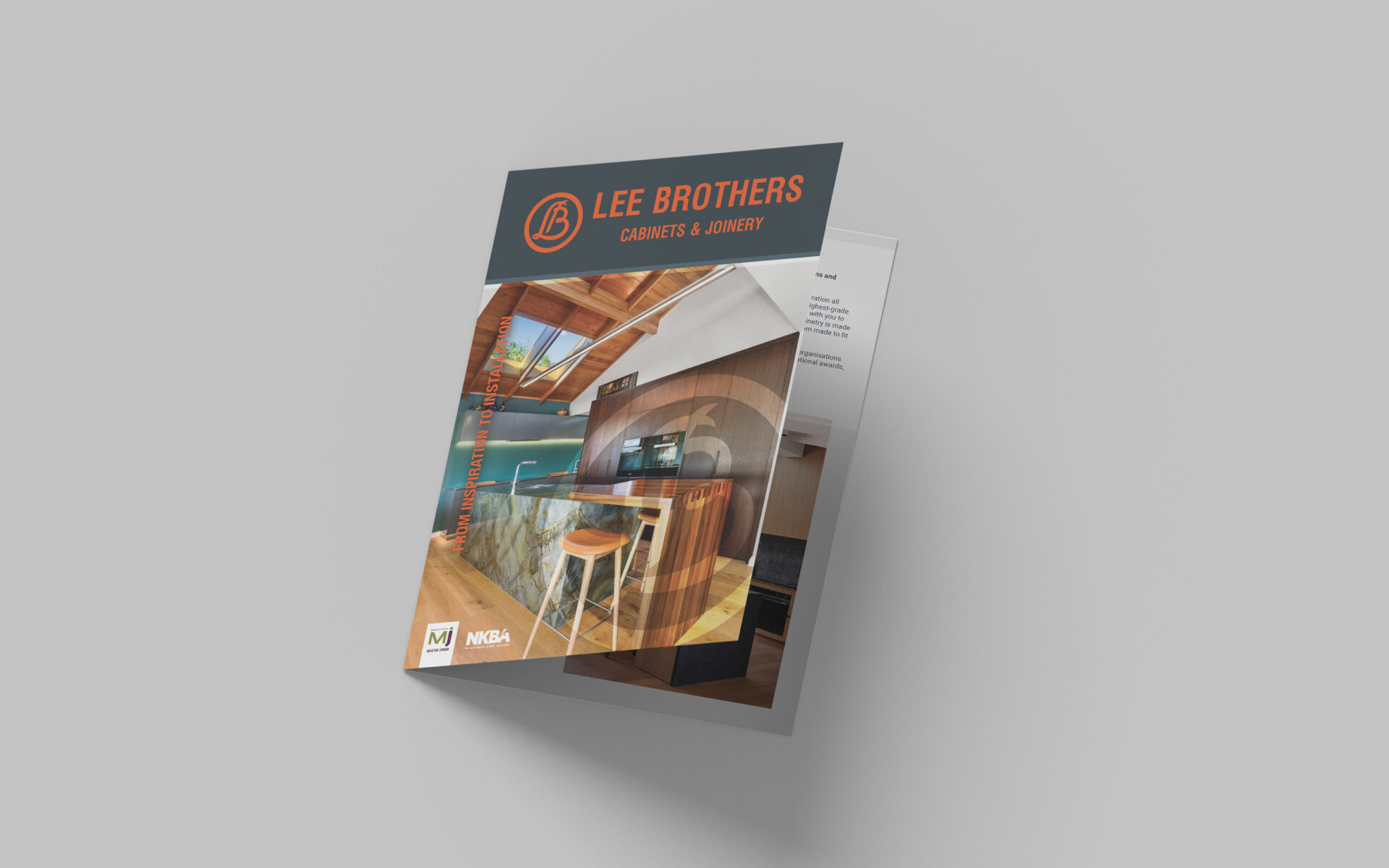
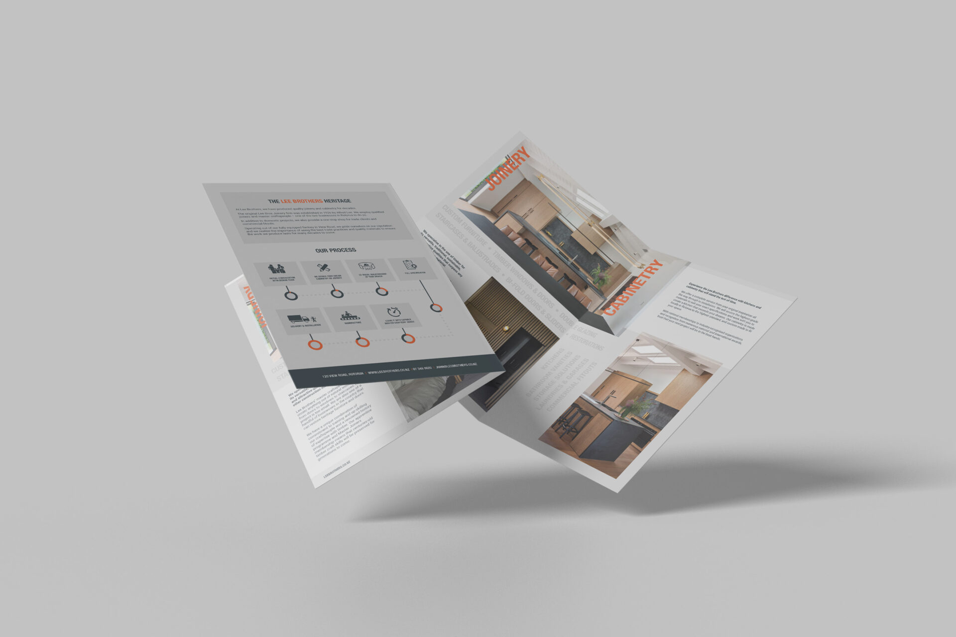
Brochure
The Lee Brothers Brochure is a key sales tool and touchpoint for information about who they are, what they do and their unique selling points. It was important to convey the crucial information in a format that allows Lee Brothers to showcase their high quality work, letting the beautiful images speak for themselves.
Design elements:
- Large, high quality images take centre stage, providing visual cues on the quality of work prospective clients can expect to receive
- Use of grey to provide an easy to read, modern and clean slate, while using their brand colours to accent and provide contrast
- Content was rewritten to provide more descriptive and emotive language, to help convey the key messages around quality, craft, and passion for their work
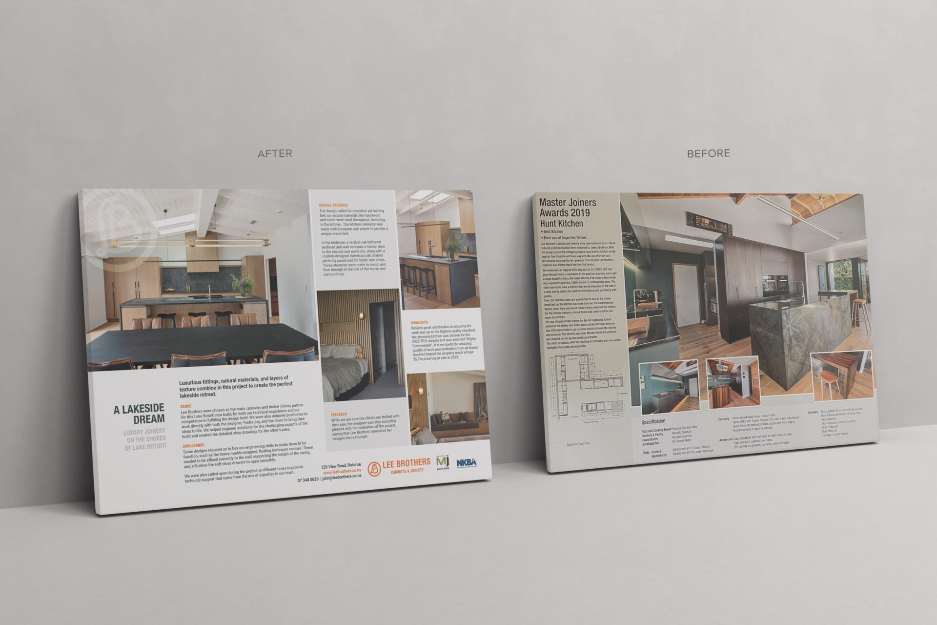
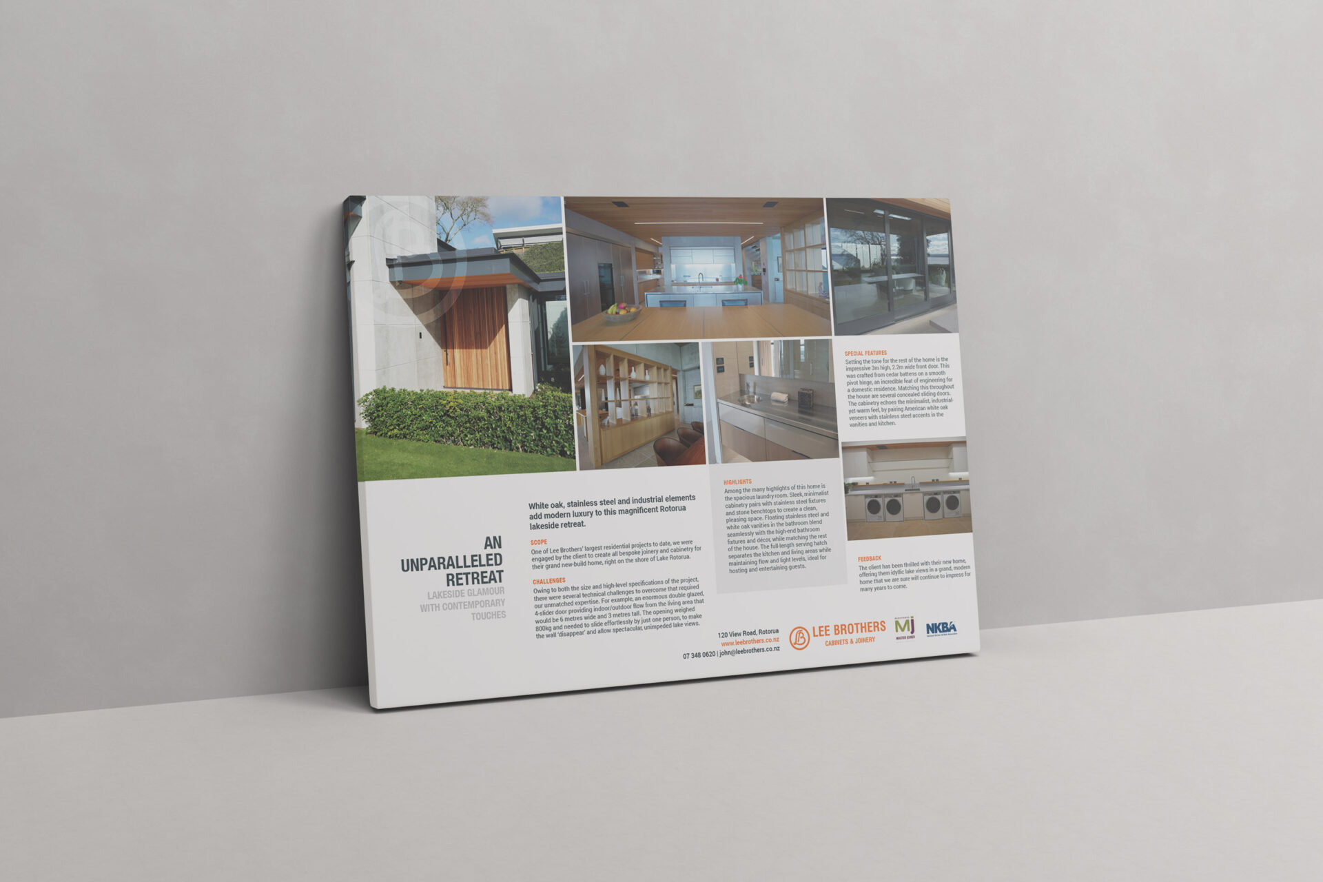
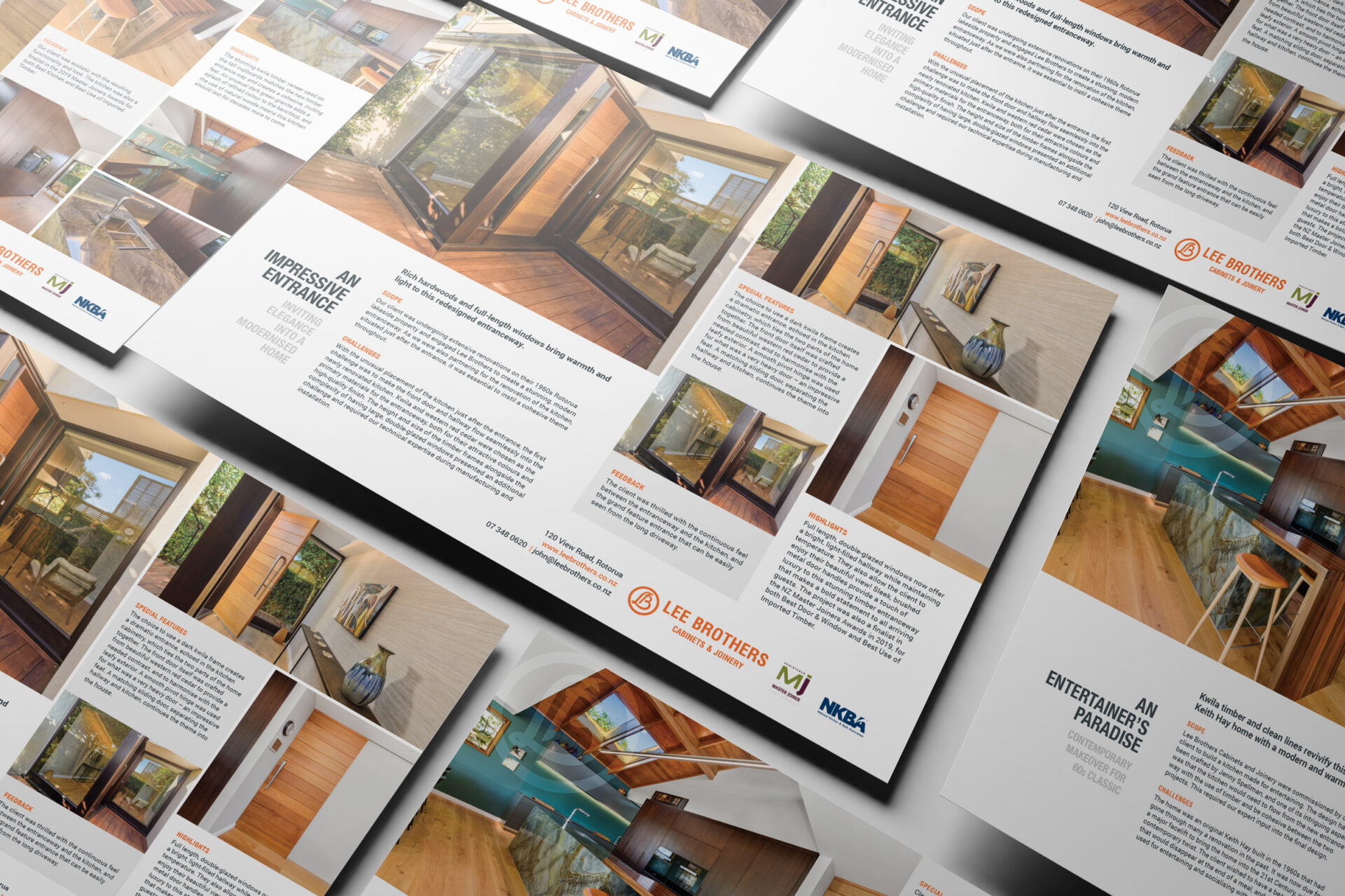
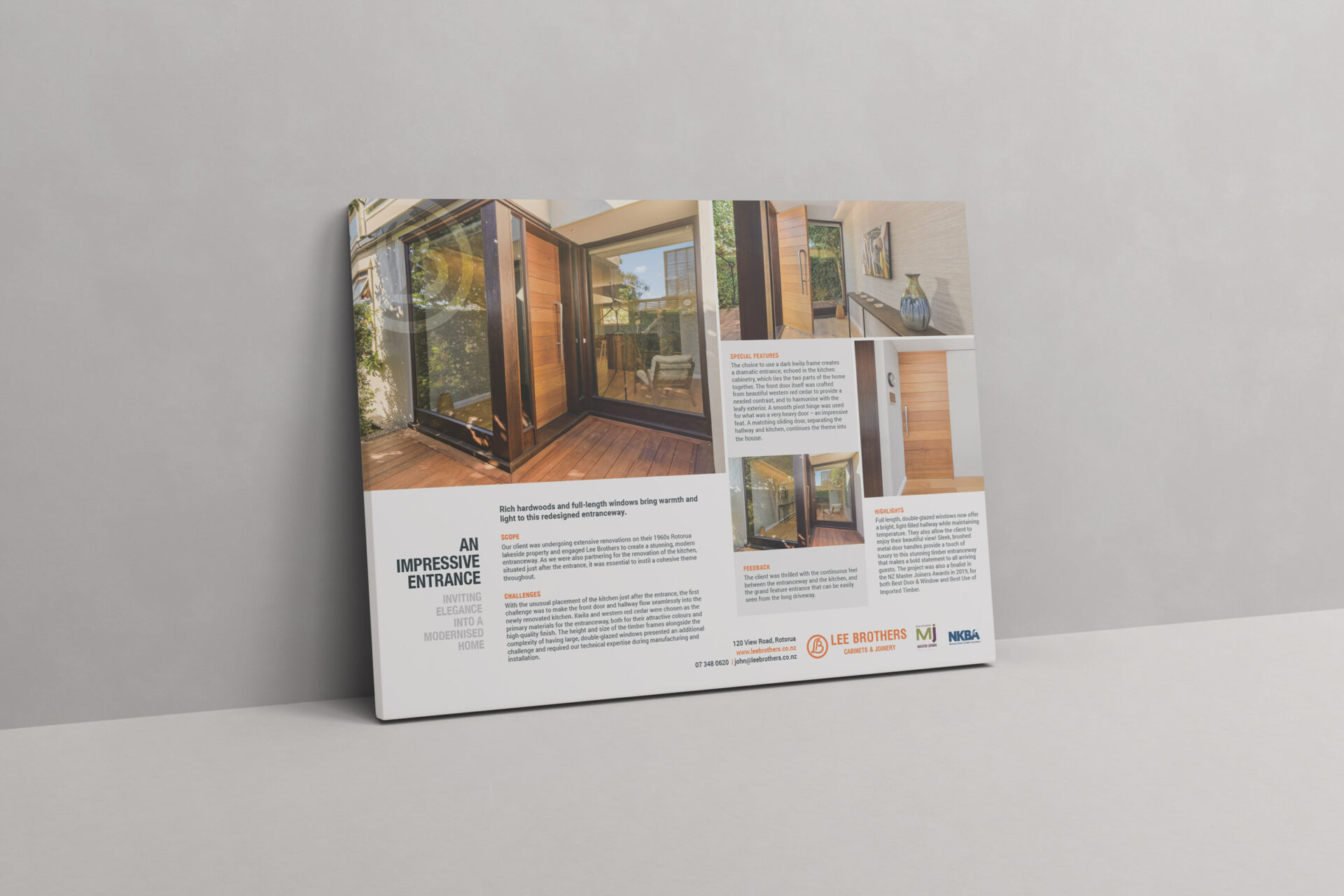
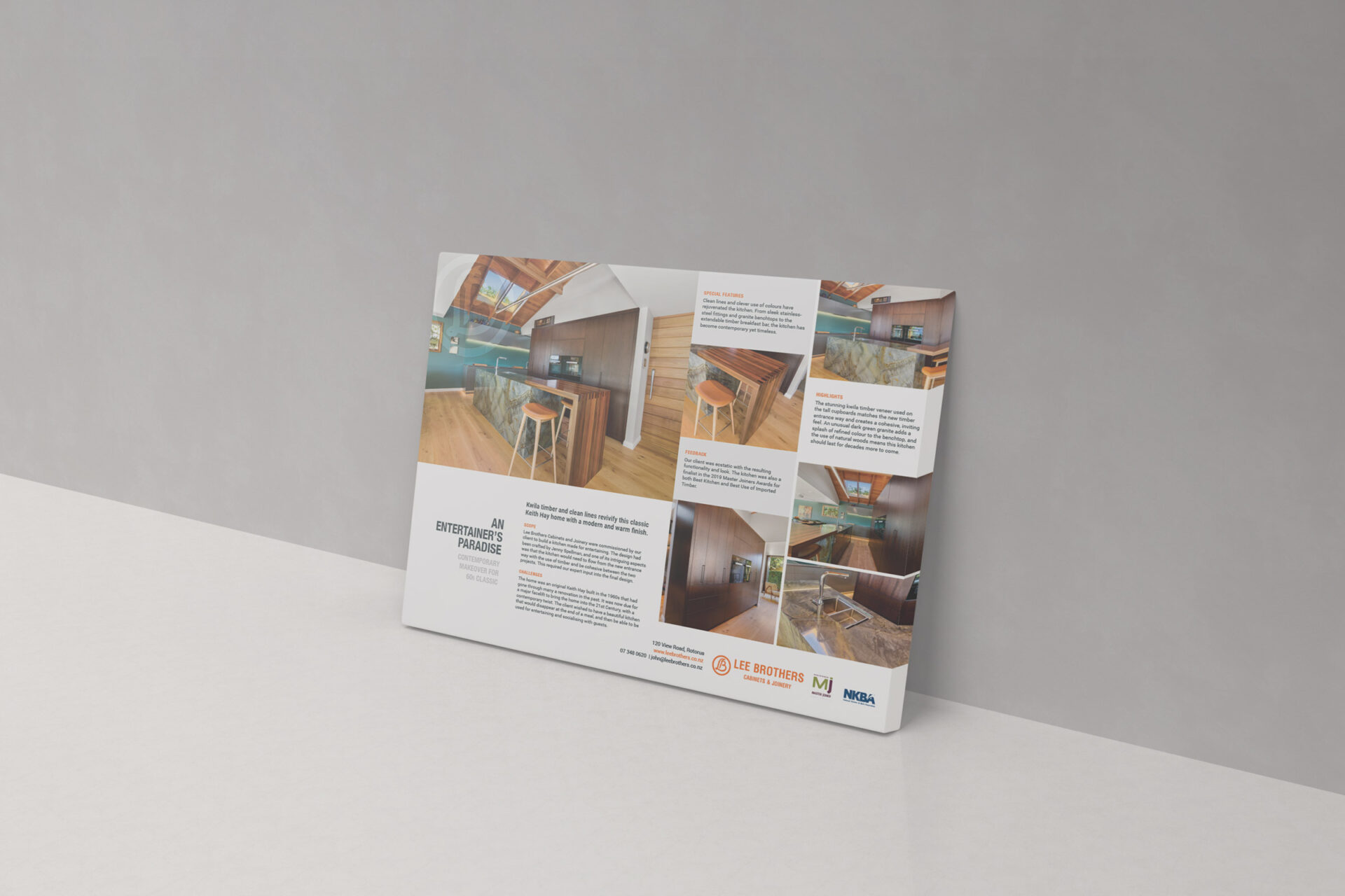
Case Studies
To provide a more in-depth focus on some of Lee Brothers’ most impressive work, we were asked to create several case studies. These would be used in a variety of placements: as large A1 signs for use at events, within a company profile document, and on their upcoming website.
Design Elements
- Keeping in line with the brochure, the use of pale grey tones to provide a clean and modern feel while working well with the orange brand colour
- A flowing, attractive layout that allows for large, high resolution images
- The translucent LB circular logo placed in top left corner retains brand recognition, while not impeding visibility of the photos
- Content was rewritten with emotive, descriptive language, easily accessible to the layperson while still providing key technical information
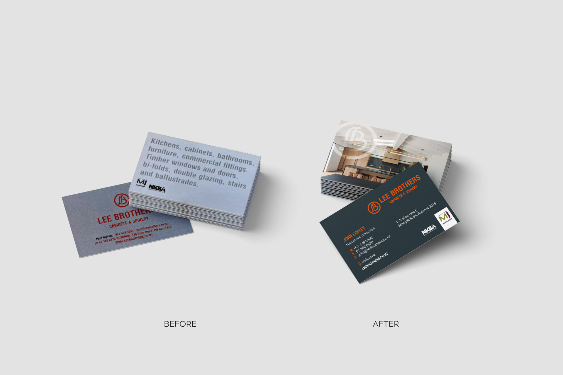
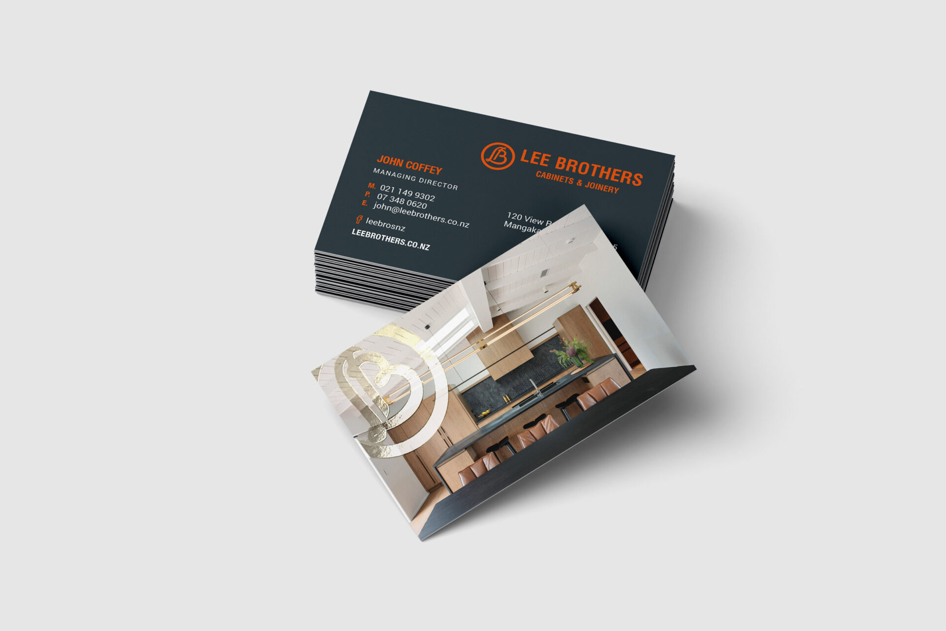
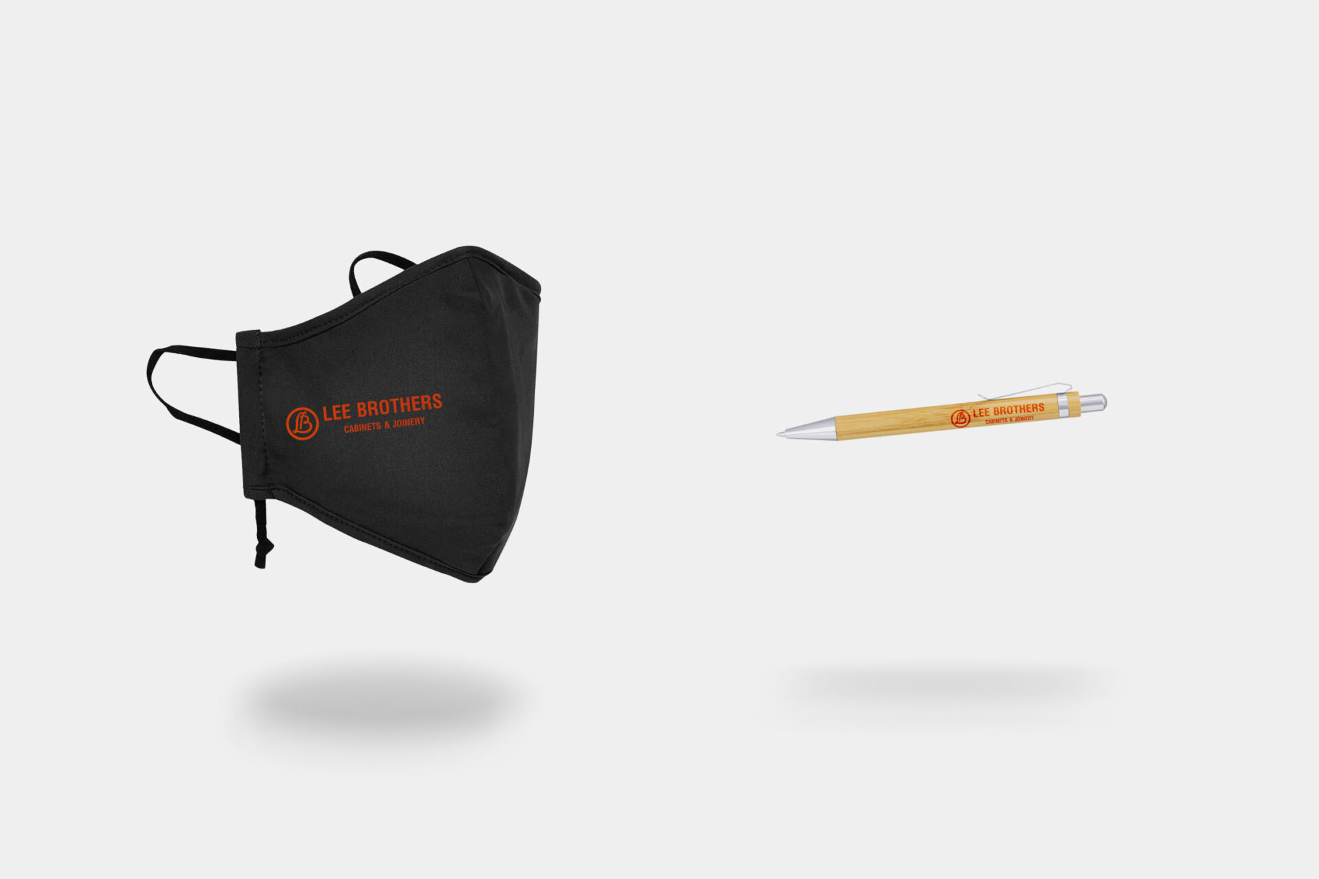
Stationery
To keep their stationery and other promotional material in line with the new brand guidelines and to reflect the high-end feel, new stationery was needed. We completely redesigned their business cards to match the new brochure and created branded facemasks and pens for their team to use in appointments and leave with clients.
Business card design elements
- Removal of text from the back of the card, replaced with a beautiful image showcasing the high quality of workmanship
- Spot UV on the back logo to provide texture and contrast
- Use of modern font on black background provides elegance and legibility
Like what you see?
Let's work together.
