Synergy Foods Packaging
Packaging design that stands out
The challenge?
Crafting two different styles for two very different markets, ensuring each design will really stand out in their relevant retail environments.
The design needed to work well for each individual package and colour, but above all, they need to look attractive side-by-side. Just like they will on the supermarket shelf!
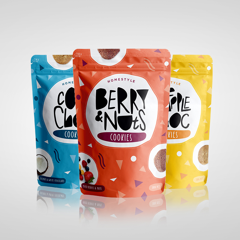
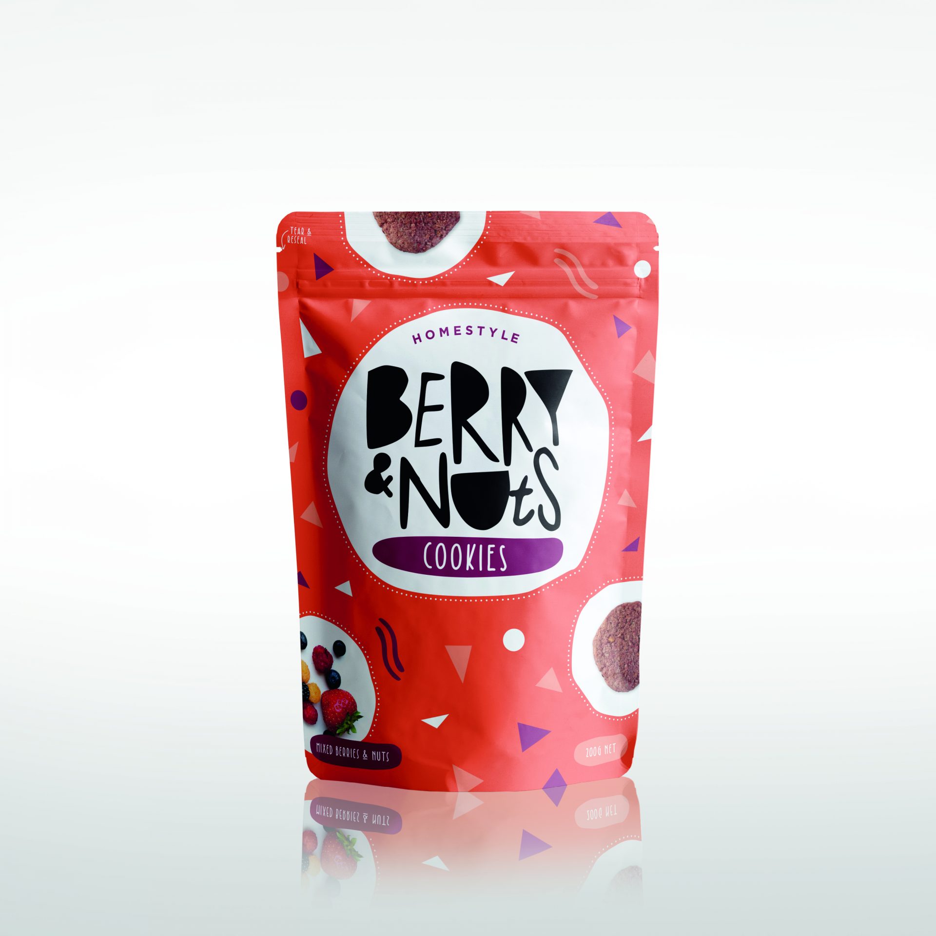
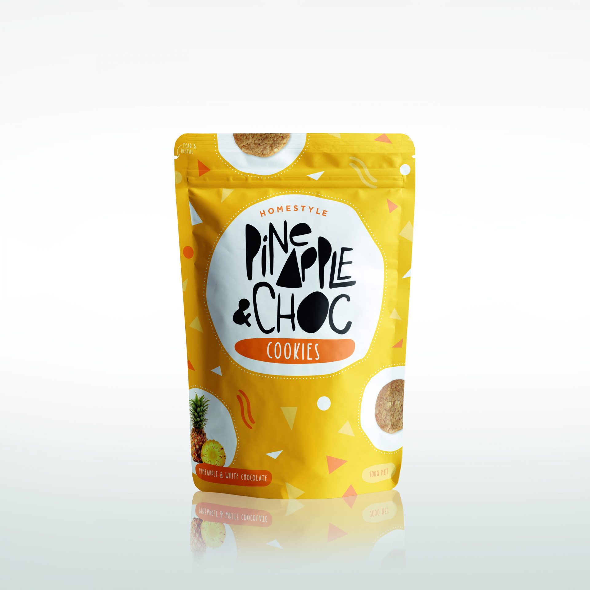
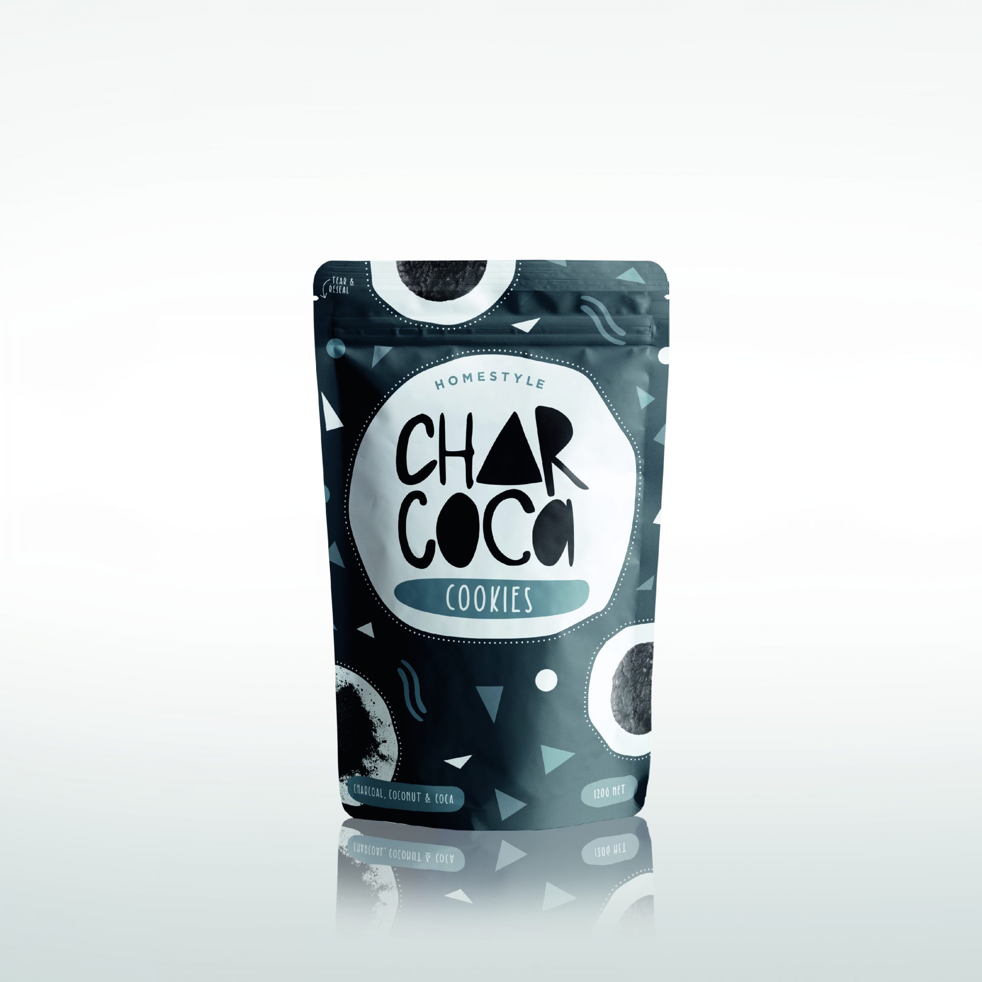
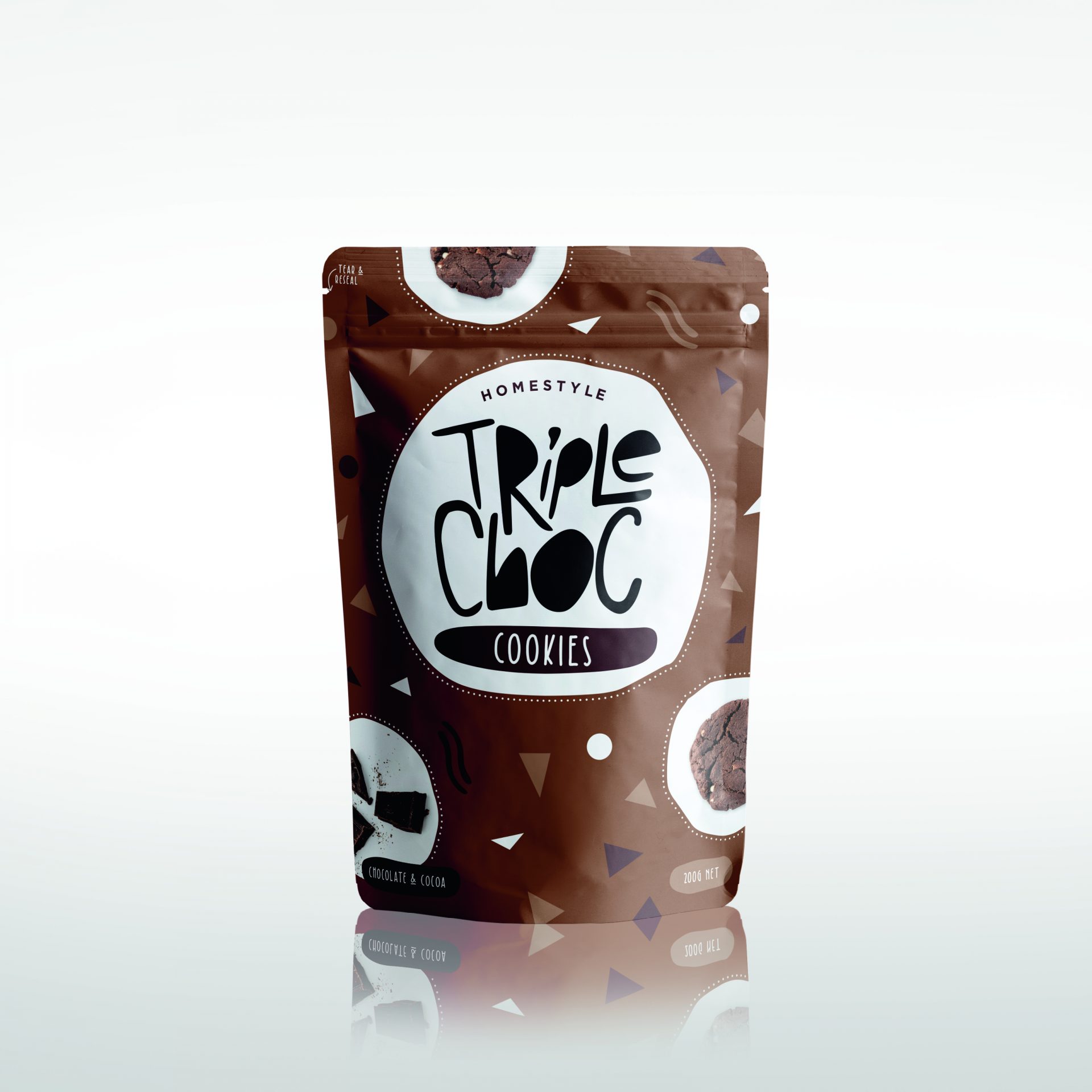
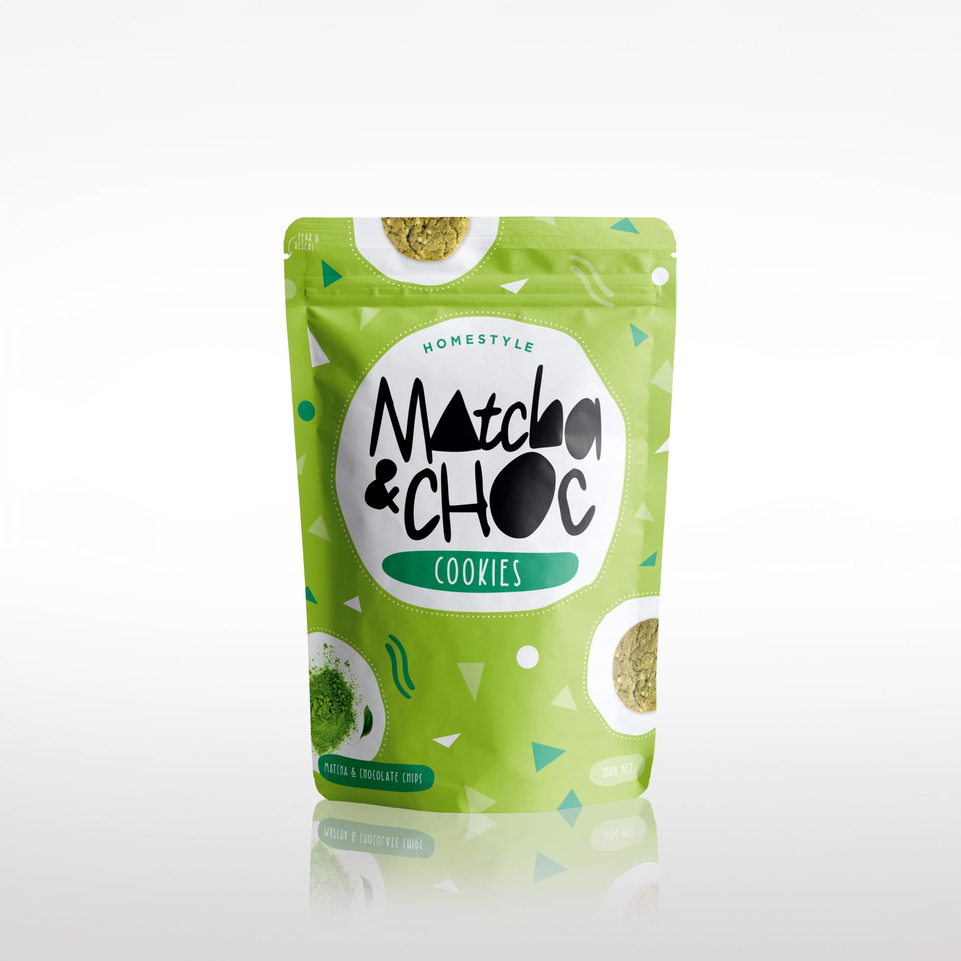
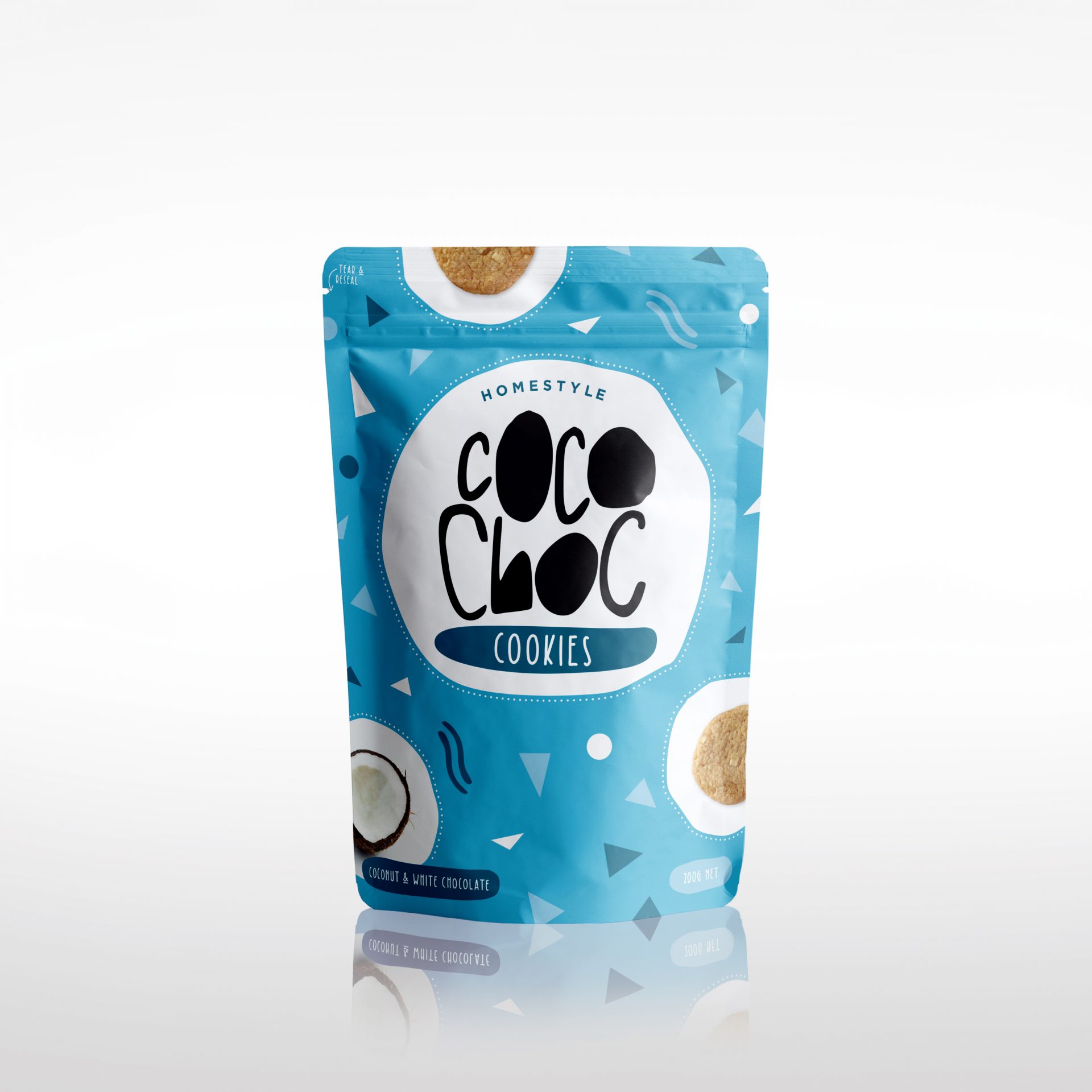
Cookies
A sweet snack for a wider, younger audience. Perfectly pairs well with a cup of tea or hot chocolate!
The brief was to create a more fun and playful packaging design without feeling childish.
The solution – Vibrant colours paired with bold & fun typography, to achieve a homestyle/crafty feel
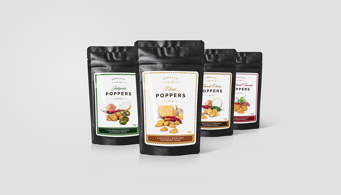
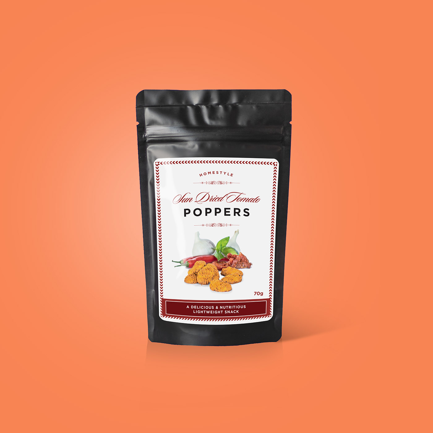
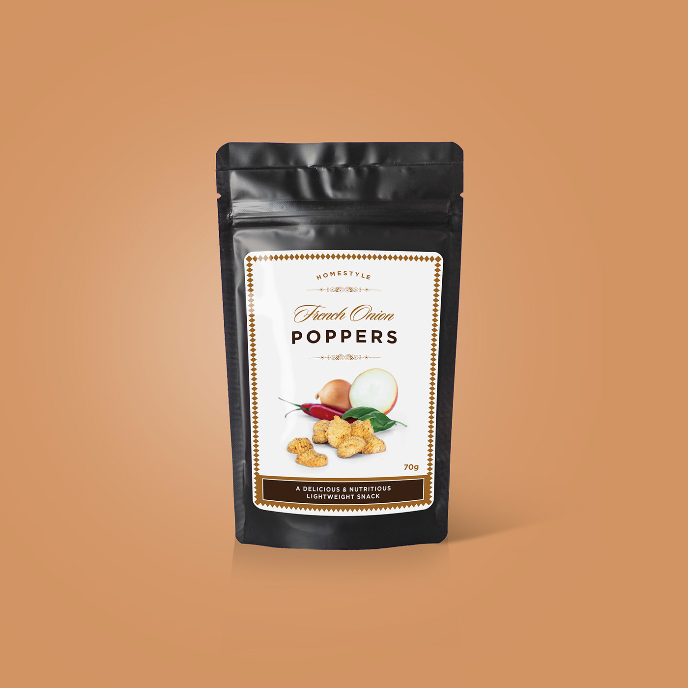
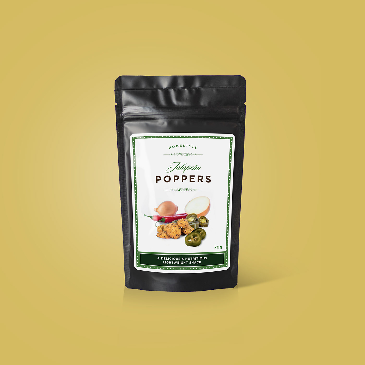
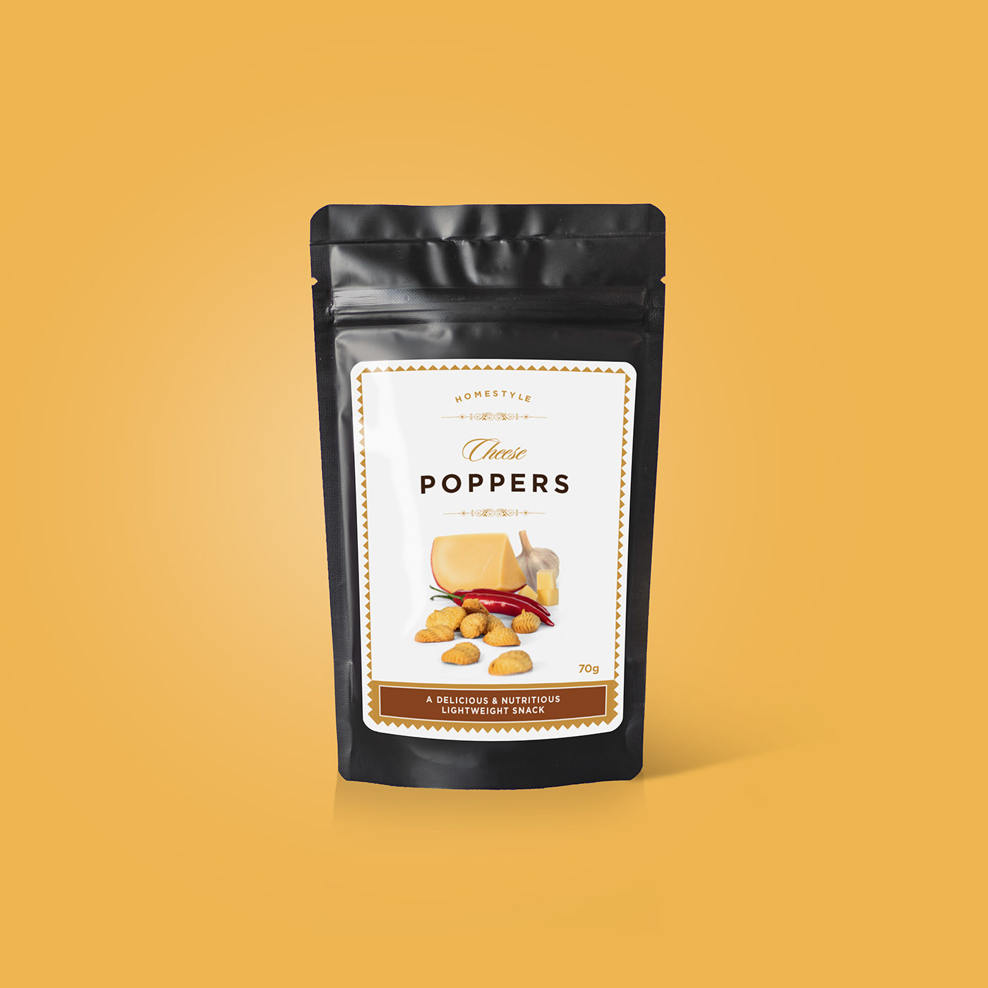
Poppers
A savory treat for a discerning, older consumer. These go well on a cheese board or with a glass of wine!
The brief was to create attractive, elegant packaging that communicates high quality.
The solution – High-quality imagery paired with chic and clean typography
Like what you see?
Let's work together.
