What Is Responsive Web Design?
February 16, 2013
Reading Time: 2 minutes
You have probably heard about responsive web design and know that it’s important, but where do you get a good responsive website and what exactly is responsive web design?
To answer the first question: you can get a professional one right here at ninetyblack; to answer the second: making a website responsive simply means it’ll work across all devices, from desktop to smartphone.
Happy customers
A responsive website does NOT get your customers frustrated because it takes forever to load on their tablet. With responsive web design your clients will NOT feel like they have sausage fingers because they keep tapping on the wrong tiny buttons on their smartphone. A responsive website is mobile device friendly.
Websites built for PC and large monitors cause ‘consumer distress’. Your potential customers impatiently and tirelessly have to re-size, scroll and work their way around your rigid site when using a mobile device, causing the dreaded ‘sausage finger syndrome’. It’s a bit like handing a prospective client a poster to go in their business card holder! Responsive web design, on the other hand, benefits your customers because it provides the optimal viewing experience. Your site will adapt, view and function on any device – computer, tablet or smartphone.
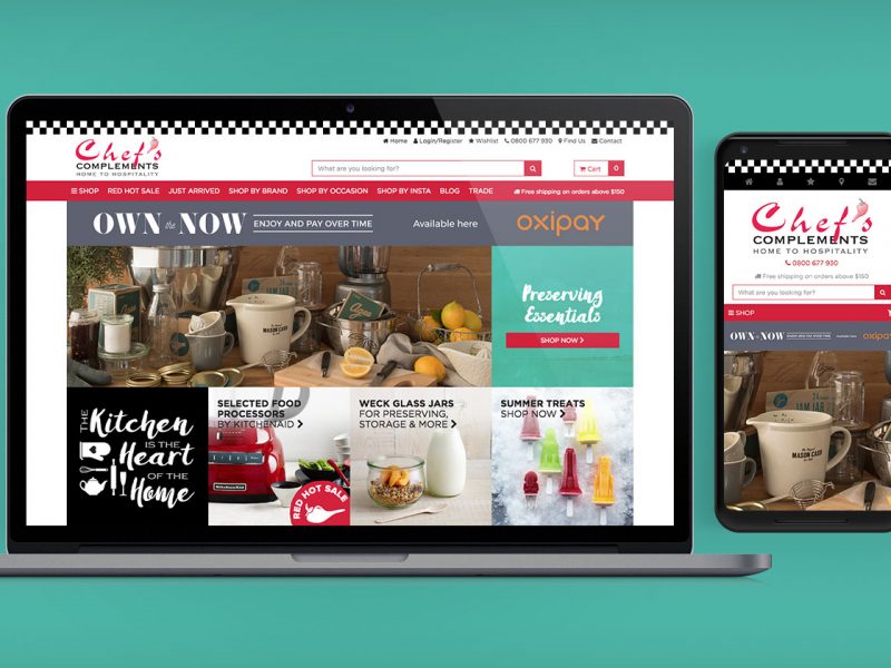
To experience responsive web design ‘live in action’, simply resize this website as you view it on your desktop computer. It’ll automatically adapt, first to the tablet version, then to a smartphone version if you make the browser window small enough! Fluid, seamless – so easy.
Are you mobile ready?
A year ago, in early 2014, mobile usage exceeded desktop internet usage in the US for the first time. Still, only over 50% of overseas websites were mobile-ready or using responsive web design. Here in NZ only just over a quarter had responsive websites. This fact gives you a powerful reason to choose responsive web design: having a responsive website will get you the edge over your competition. You’ll also save time and money, boost your SEO efforts and your online presence will be future-proof. We have compiled a handy list with more detailed info in our blog: Top 10 Reasons for Getting a Responsive Website.
Why ninetyblack?
Now that you know why we at ninetyblack build responsive websites, the question remaining is: why to choose ninetyblack for your new future-proof, mobile-ready website? The answer is simple: with us you get more than just a responsive website. As with everything else in life, there are different levels of responsive web design. You may have come across websites which work fine on your smartphone but page break points and other little details don’t quite work or still display funny on mobile devices. At ninetyblack we’re lucky to have an extremely particular, almost nitpicking, web designer on board (sorry Matt!) who is the master of attention to detail. We’ll ensure that your responsive website is 100% polished and that the design is fluid and tidy across all devices.
If you choose us, your customers will never suffer from sausage fingers, awkward user experience or funny mobile displays again. So why not pick up the phone or flick us an email so we can make sure you get the edge over your competition?!